25

As we are approaching 90 days, it is time to get us back to answering the 7 Essential Questions.

In terms of site design, we ultimately need to consider a number minutiae such as logo, the top banner, the look of our badges, the color scheme used, etc. As this is a large topic, this question should act as a discussion forum for ideas. In particular, we should concentrate on the logo as it will represent us outside of this community.

4
  • 1
    See also meta.mathematica.stackexchange.com/questions/119/…
    – cormullion
    Commented Apr 4, 2012 at 8:50
  • 3
    I would think the best possible logo would be some version of the Mathematica spikey logo, if we could get permission from Wolfram.
    – Isaac
    Commented Apr 4, 2012 at 15:17
  • @Isaac I wouldn't mind, but the key is we need some form permission. Andy Ross emailed a friend who may know the info/who to ask, so we'll see.
    – rcollyer
    Commented Apr 4, 2012 at 15:25
  • Wouldn't the use of a spikey suggest that this is an official Wolfram site, at least to some visitors?
    – cormullion
    Commented Apr 4, 2012 at 16:06

16 Answers 16

20

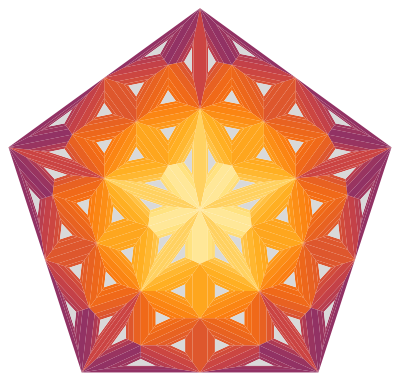
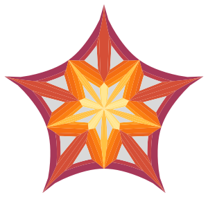
Inspired by F'x, here's a 2D analogue of spikey. Done with a bunch of rules because I like them, and they make it clear what is going on.

Start with a pentagon:

p = Polygon[Table[N[{Cos[t], Sin[t]}], {t, \[Pi]/10, 2 \[Pi], (2 \[Pi])/5}]];

1

Make a rule to split any polygon into triangles (centroid to each edge):

triangulate = Polygon[v_] :> (Polygon[Append[#, Mean[v]]] & /@ Partition[v, 2, 1, {1, 1}]);

2

A rule to split triangles into the spikey face structure:

moretriangles = Polygon[{a_, b_, c_}] :> 
   With[{ab = (a + b)/2, bc = (b + c)/2, ca = (c + a)/2}, {
     Polygon[{a, ab, ca}],
     Polygon[{ab, b, bc}],
     Polygon[{c, ca, ab}],
     Polygon[{c, ab, bc}]
   }];

3

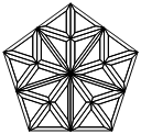
Put a triangle inside each triangle (which will be done twice):

shrink = Polygon[{a_, b_, c_}] :>
   With[{aa = (6 a + b + c)/8, bb = (a + 6 b + c)/8, cc = (a + b + 6 c)/8}, {
     Polygon[{a, b, bb, aa}],
     Polygon[{b, c, cc, bb}],
     Polygon[{c, a, aa, cc}],
     Polygon[{aa, bb, cc}]
   }];
45

Add some colour:

colour4 = q : Polygon[{_, _, _, _}] :> {ColorData["NeonColors"][RandomReal[]], q};
colour3 = q : Polygon[{_, _, _}] :> {RGBColor[0.6, 0.12, 0.12], q};

6

Split each polygon edge into a series of small steps, so we will get curves when we transform it:

curve = Polygon[v_] :> FilledCurve[
    Line[Map[{10 - #, #}/10 &, Range[0, 10]].#] & /@ 
    Partition[v, 2, 1, {1, 1}]];

The hyperbolic transformation:

f[r_] := Re[(ArcSin[2 r - 1] + \[Pi]/2)/2];
bolics = v : {_?NumberQ, _} :> f[Norm[v]] v;

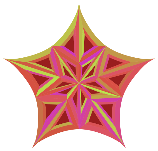
to finally give:

Graphics[p /. triangulate /. moretriangles /. shrink /. shrink /. colour3 /. colour4 /.
         curve /. bolics]
7

EDIT

Now with better different colours!

Clear[colour4]; 
colour4[s_] := q : Polygon[{_, _, _, _}] :> {ColorData[s][RandomReal[]], q};

SeedRandom[8];
Graphics[p /. triangulate /. moretriangles /. shrink /. shrink /. colour3 /. 
  colour4["SouthwestColors"] /. curve /. bolics]

8

And some badges with the hyperbolic polygon theme:

Clear[bolics2];
bolics2[s_] := v : {_?NumberQ, _} :> (s f[Norm[v]] + 1 - s) v;
Clear[poly];
poly[start_, n_] := Polygon[Table[N[{Cos[t], Sin[t]}], {t, start, 2 \[Pi], (2 \[Pi])/n}]];
Grid[List[Graphics[{Gray, Translate[#[[2]], {0, -0.2}], #}, ImageSize -> 15] & /@
  {{RGBColor[237/255, 198/255, 47/255], poly[\[Pi]/10, 5] /. curve /. bolics2[1]},
   {RGBColor[218/255, 218/255, 218/255], poly[0, 4] /. curve /. bolics2[2/3]},
   {RGBColor[226/255, 154/255, 84/255], poly[\[Pi]/2, 3] /. curve /. bolics2[1/2]}}]]

GoldSilverBronze


Addendum by J.M.

I wasn't too fond of our proposed logo having a Random* component, and set about looking for a slightly more systematic coloring scheme. Here is what I came up with:

colour3[s_: LightGray] := q : Polygon[{_, _, _}] :> {s, q}

PolygonCentroid[pts_?MatrixQ] := With[{dif = Map[Det, Partition[pts, 2, 1, {1, 1}]]}, 
  ListConvolve[{{1, 1}}, Transpose[pts], {-1, -1}].dif/(3 Total[dif])]

colour4[s_: "SouthwestColors"] := Polygon[v_] /; Length[v] == 4 :>
        {ColorData[s, (7 Norm[PolygonCentroid[v], 2] - 2)/4], Polygon[v]}


Graphics[p /. triangulate /. moretriangles /. shrink /. shrink /. 
     colour3[] /. colour4[] /. curve /. bolics]

new logo?

13
  • 1
    This is the best one so far... your approach reminds me of how Michael Trott designed the logo for v6.
    – rm -rf Mod
    Commented May 20, 2012 at 23:20
  • Yes, I should have mentioned that I did look at that, and also stole the transformation function from there.
    – wxffles
    Commented May 21, 2012 at 0:38
  • Indeed, the best one so far! Big +1. It can be easily adapted for a site 'favicon' too.
    – Szabolcs
    Commented May 21, 2012 at 9:00
  • 3
    You could consider making use of BlockRandom/SeedRandom to make the end result exactly reproducible.
    – Szabolcs
    Commented May 21, 2012 at 10:33
  • 3
    I like the graphics very much, but not the colours. I think there's too little contrast in there.
    – celtschk
    Commented May 21, 2012 at 17:19
  • I don't really like the colours either. Everyone is free to edit it and improve them!
    – wxffles
    Commented May 21, 2012 at 20:28
  • 1
    You already had my +1, but the badges tops it for me.
    – rcollyer
    Commented May 23, 2012 at 0:39
  • 1
    Love the badges - pity I can't vote twice (no bounties on meta)
    – Verbeia
    Commented May 23, 2012 at 3:59
  • We should use this design for a community promotion ad. @J.M. SeedRandom should fix your concerns with randomness. I like random colouring, but it's worth finding a seed which produces a really nice one (it also makes it reproducible).
    – Szabolcs
    Commented May 23, 2012 at 7:36
  • 1
    @Szabolcs: I know about SeedRandom[]/BlockRandom[]; I just don't like the idea of random colors being used for a logo. Commented May 23, 2012 at 7:55
  • @J.M. and wxffles -- I reused your desgin for a community ad.
    – Szabolcs
    Commented May 23, 2012 at 10:27
  • Very purty, very purty.
    – CHM
    Commented May 31, 2012 at 17:04
  • I like how this example walks through the construction step by step. Is there any book dedicated to examples of this style? (i.e. constructing amazing mathematically rigrous graphics step by step)
    – user1602
    Commented Jul 14, 2012 at 22:05
16

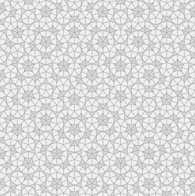
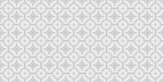
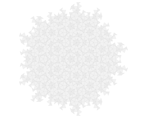
Here's my go at creating a seamlessly repeatable background pattern similar to the dart-kite Penrose tiling. Personally I would prefer the rhombus tiling, but I did not manage to make a periodic approximation to that one yet.

Several people mentioned that it would be nice to have a background based on some sort of Penrose tiling. The problem with Penrose tilings is that they're aperiodic while Jin needs a periodically tileable image for the website's background. So I had to cheat a little to make the pattern repeatable.

First, here's a sample of the result (please click to magnify!):

Mathematica graphics

Edit: here's an alternative made using draw2:

Mathematica graphics

This is the "base cell" that can be repeated in a RЯRЯRЯRЯRЯRЯ fashion horizontally only to create a fake Penrose tiling that looks convincing enough. If you look closely enough you'll notice that some of the tiles are neither a kite nor a dart but a parallelogram---an artefact of making the pattern periodic.

Mathematica graphics

Another possibly interesting variation which I did not have time to implement as vector art (it's easier using image processing) is to trace out the boundary between the light and dark regions only (and not the boundary of each kite and dart).


The code follows at the end. It's based on 'deflation'. Please "steal" the code, make other variations, and post them! If you need me to explain some part of the code, post a comment, please!

(* rotate vector by 90 deg *)
rot90[{x_, y_}] := {-y, x}
(* divide the segment AB using ratio R *)
div[a_, b_, r_] := a + (b - a) r

deflate =
  {ki[a_, b_, o_: 1] :>
    With[
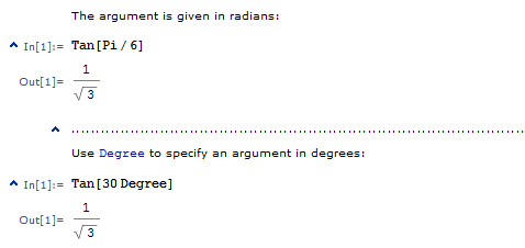
     {c = (a + b)/2 + o rot90[b - a] 1/2 Tan[72 Degree]},
     With[
      {d = div[c, a, 1/GoldenRatio],
       e = div[b, c, 1/GoldenRatio]},
      {ki[d, a, o], ki[d, e, -o], da[c, d, o]}
      ]
     ],
   da[a_, b_, o_: 1] :>
    With[
     {c = (a + b)/2 + o rot90[b - a] 1/2 Tan[36 Degree],
      d = div[a, b, 1/GoldenRatio]},
     {ki[c, d, -o], da[b, c, o]}
     ]
   };

(* kite and dart colours *)
kico = GrayLevel[0.93];
daco = GrayLevel[0.85];

draw =
  {ki[a_, b_, o_: 1] :>
    With[
     {c = (a + b)/2 + o rot90[b - a] 1/2 Tan[72 Degree]},
     {kico, Polygon[{a, b, c}]}
     ],
   da[a_, b_, o_: 1] :>
    With[
     {c = (a + b)/2 + o rot90[b - a] 1/2 Tan[36 Degree]},
     {daco, Polygon[{a, b, c}]}
     ]
   };

(* line colour *)
lico = GrayLevel[0.65]

(* draw the outlines of tiles too *)
draw2 =
  {ki[a_, b_, o_: 1] :>
    With[
     {c = (a + b)/2 + o rot90[b - a] 1/2 Tan[72 Degree]},
     {kico, Polygon[{a, b, c}], {lico, Line[{a, b, c}]}}
     ],
   da[a_, b_, o_: 1] :>
    With[
     {c = (a + b)/2 + o rot90[b - a] 1/2 Tan[36 Degree]},
     {daco, Polygon[{a, b, c}], {lico, Line[{a, b, c}]}}
     ]
   };


(* apply the deflation n times *)
defl[expr_, n_] := Nest[# /. deflate &, expr, n] /. draw

(* for "straightening" the pattern *)
r = RotationTransform[-18. Degree];

g = Graphics[
  {EdgeForm[None], 
   defl[N@{ki[r@{0, 0}, r@{1, 0}], 
      ki[r@{1/2, 1/2 Tan[72 Degree]}, r@{-1/2, 1/2 Tan[72 Degree]}]}, 
    9]}
  ]

(* rasterize the graphics, avoiding visible seams between polygons *)
rast = ImageResize[
    Rasterize[Style[#, Antialiasing -> False], "Image", 
     ImageResolution -> 3 72], Scaled[1/3]] &;

img = rast[Show[g, ImageSize -> 400]]

(* crop and assemble the tile *)
img = ImageCrop[img];

ImageCrop[
 ImageAssemble[
  Table[Unevaluated@
    Sequence[img, ImageReflect[img, Left -> Right]], {3}]], {Full, 
  200}]
1
  • Very nice work, +1. Commented Jul 13, 2012 at 12:18
12

I'm usually of the opinion that the job of design should be left to professional designers, because they (ought to) know what they're doing. Of course, we can all look at designs around us and say to ourselves "I could do better than that!", but our tastes are so different: I love the things that you hate, and vice versa. (Consider the logo for the 2012 London Olympics - http://blog.gale.com/speakingglobally/the-view-from-here/london-2012-olympics-logo-an-emblem-of-controversy/ - a lot of people really dislike it.)

Having said all that, I'm happy to join in the fun and post ideas for logos and graphics for the Mathematica site. If nothing else, some practice in criticising and abusing designs should come in handy when the real designers move in... :)

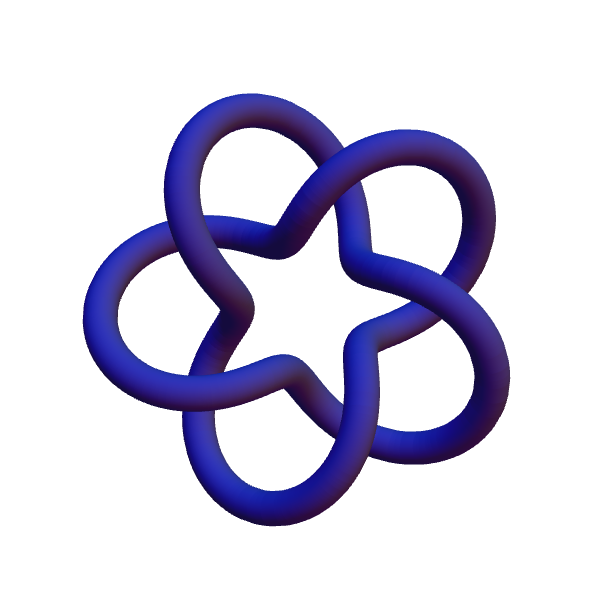
a logo

Rationale: It's supposed to be simple (and should work as an icon), it's made of gold (although it looks a bit more coppery than I expected), and it's definitely not a spikey, although it is made with Mathematica and shows some of Mathematica's image and 3D graphics abilities.

5
  • 5
    The logo should definitely be generated in MMA.
    – CHM
    Commented Apr 4, 2012 at 13:23
  • 3
    Is the code to generate this short enough to include in the answer? Commented Apr 4, 2012 at 14:44
  • @BrettChampion I agree, the code is a must.
    – rcollyer
    Commented Apr 4, 2012 at 15:33
  • 2
    @BrettChampion Yes, I'd think so, and it could easily be added as the discussion continues. And yet it's probably not a good idea to get side-tracked into code and coding just yet, since we should be discussing design at a higher, more visual, level. (PS: Graphics3D[KnotData[{"TorusKnot", {2, 5}}, "ImageData"], ViewVector -> {{0, 0, 5}, {0, 0, 0}}] :)
    – cormullion
    Commented Apr 4, 2012 at 16:03
  • @cormullion At first I thought you had made the graphic yourself - not with MMA data. Even if it looks nice, I'm of the opinion that the logo should be designed ab initio, with the code available to everyone.
    – CHM
    Commented Apr 22, 2012 at 17:30
9

I think it would be a nice and useful addition, fitting the site's infrastructure, to have some of the built-in styles of Mathematica here. I'm not sure this would be approved by SE, as it is possible, that they only allow for one type of quote-style and one type of code-style, but certainly it is possible to implement. For example, quotation from the online documentation should look like this:

Mathematica graphics

Of course, uploading an image always works, but is a waste of bandwidth. I also find the dotted horizontal divider useful to visually separate examples:

Mathematica graphics

2
  • 1
    I like this, good idea.
    – CHM
    Commented Apr 22, 2012 at 17:24
  • I don't like this idea very much. It should be recognizable, but I'm spending enough time in Mathematica already. I'm coming here to take a break from my work, not to extend it. The design should be related, but not too similar to Mathematica.
    – David
    Commented Apr 23, 2012 at 18:40
9

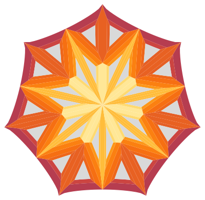
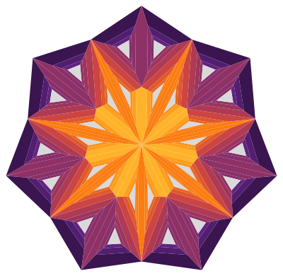
Since the original logo has turned out to be a bit too close to the Mathematica logo for Wolfram's lawyers' comfort, here are a few alternatives that maintain the essential look and color palette, but are different enough to hopefully skirt around the problem.

Of course, we can have any combination of number of points, stellation, and additional complexity, and the colors can be tweaked to suit.

I am using the same code as in J.M.'s post, except that:

colour4[s_: "SunsetColors", a_?NumericQ, b_?NumericQ] := Polygon[v_] /; 
  Length[v] == 4 :> {ColorData[s, a - b Norm[PolygonCentroid[v]]], 
  Polygon[v]}

tweakable curvature:

bolicsn[n_] := 
  v : {_?NumberQ, _} :> v Re[(ArcSin[2 Norm[v] - 1] + Pi/n)/2];

and the starter code can be any one of:

p4 = Polygon[Table[N[{Cos[t], Sin[t]}], {t, Pi/10, 2 Pi, 2 Pi/4}]];
p5 = Polygon[Table[N[{Cos[t], Sin[t]}], {t, Pi/10, 2 Pi, 2 Pi/5}]];
p6 = Polygon[Table[N[{Cos[t], Sin[t]}], {t, Pi/6, 2 Pi, 2 Pi/6}]];
p7 = Polygon[Table[N[{Cos[t], Sin[t]}], {t, Pi/14, 2 Pi, 2 Pi/7}]];
p7b = Polygon[Table[N[{Cos[t], Sin[t]}], {t, 3 Pi/14, 2 Pi, 2 Pi/7}]];
p8 = Polygon[Table[N[{Cos[t], Sin[t]}], {t, Pi/4, 2 Pi, 2 Pi/8}]];

Seven-point alternative

I think a seven-point alternative will be less likely to attract problems, especially if it is more purple and gold than orange-red, and less spiky. Some alternatives:

Graphics[p7b /. triangulate /. moretriangles /. shrink /. shrink /. 
 colour3[] /. colour4["SunsetColors", 9/8, 31/34] /. curve /. 
 bolicsn[0.4], ImageSize -> 400]

enter image description here

Or

Graphics[p7b /. triangulate /. moretriangles /. shrink /. shrink /. 
 shrink /. colour3[] /. colour4["SunsetColors", .95, 32/34] /. 
 bolicsn[0.4], ImageSize -> 400]

enter image description here

Older versions

Example 1: Pentagon, not hyperbolic

Graphics[p5 /. triangulate /. moretriangles /. shrink /. shrink /. 
shrink /. colour3[] /. colour4[], ImageSize -> 400]

enter image description here

Example 2: Heptagon, not hyperbolic

Graphics[p7 /. triangulate /. moretriangles /. shrink /. shrink /. 
shrink /. colour3[] /. colour4["SunsetColors", 1, 28/34], ImageSize -> 400]

enter image description here

Example 3: Octagon, hyperbolic

Graphics[p8 /. triangulate /. moretriangles /. shrink /. shrink /. 
 colour3[] /. colour4["SunsetColors", 9/8, 31/34] /. curve /. bolics, ImageSize -> 400]

enter image description here

Example 4: A fussier non-hyperbolic pentagon
This probably needs the mesh lines to be turned off, which I haven't worked out how to do.

Graphics[p5 /. triangulate /. triangulate /. moretriangles /. 
   shrink /. shrink /. shrink /. colour3[] /. Mesh -> None /. 
   colour4["SunsetColors", 1, 30/34], ImageSize -> 400]

enter image description here

Example 5: less curved version of the original pentagon

Graphics[{p5 /. triangulate /. moretriangles /. shrink /. shrink /. 
  colour3[] /. colour4[] /. curve /. bolicsn[0.75]}, ImageSize -> 400]

enter image description here

2
  • Thank you so much for these! May I have the vector for example 2? It's been approved by WRI.
    – Jin
    Commented Jul 16, 2012 at 6:29
  • Sorry someone else will have to replicate this (the code is there) as I am on a business trip with just an iPad.
    – Verbeia
    Commented Jul 16, 2012 at 14:33
9

Another approach to get something like a Penrose pattern which can be used for a tiled image is to start from a square.

Mathematica graphics

These triangles don't follow the golden ratio rule which is usually required for Penrose patterns, but the iteration can be used anyway. Using these triangles as half-darts, one could now start to generate the subtriangles following the rules of deflation for P2 and P3 tilings.

The good thing here is, that this tile is instantly repeatable in any direction.

Mathematica graphics

Implementation

The code is really simple. Just look in the above link that there are two kinds of triangles. Every triangle has its own subdivision rule which is just a combination of the sides and one or two new points on some triangle-sides. Using t1 for the half-kites and t2 for the half-dartes the subdivision rule is

subdivide = {
   t1[{a_, b_, c_}] :> 
    With[{p1 = a + (b - a)/GoldenRatio, 
      p2 = c + (a - c)/GoldenRatio},
     {t2[{p2, p1, a}], t1[{c, p1, b}], t1[{c, p1, p2}]}], 
   t2[{a_, b_, c_}] :> With[{p = c + (b - c)/GoldenRatio},
     {t1[{c, a, p}], t2[{p, a, b}]}
     ]
   };

The used points a,b,c are here complex numbers and if you want to draw them, you take real and imaginary part.

draw = {
   t1[arg_] :> {GrayLevel[.95], Polygon[{Re[#], Im[#]} & /@ arg]}, 
   t2[arg_] :> {GrayLevel[.85], Polygon[{Re[#], Im[#]} & /@ arg]}
   };

That's it. More is in the basic version not required. The only thing which is missing is some initial triangle or set of triangles. The rest is easy. Take the initial triangle(s) and apply the sub-division rule as often as you want, use the draw rule at the end and wrap Graphics around it.

With[{initial = t1[{0.0, Exp[-I*Pi/10.0], Exp[I*Pi/10.0]}]},
 Graphics[Nest[# /. subdivide &, initial, 6] /. draw]
 ]

Mathematica graphics

Remark 1: the first coordinate in t1 is always the top corner (36 deg) and in t2 right corner (108 deg) of the triangles in this image. The order of the last two points of the triangles does matter, because the next subdivision step is not symmetric. For instace, in my first square image above, the center point is always the first coordinate in each triangle but the other two points are specified in a way that neighboring triangles have not the same circumferential direction.

Remark 2: Since until the draw rule is applied we have complex numbers, it is really easy to use most transformations like translation, rotation, etc. A rule for translation and rotation is just

trans[p_] := (h : (t1 | t2))[pts_] :> h[pts + p];
rot[phi_] := (h : (t1 | t2))[pts_] :> h[pts*Exp[I phi]];

With the first triangulated square (pts) you can create a tiling by using the trans rule in a table

With[{pts = Table[
    t2[{0, Exp[I (phi - Pi/4.0)], 
       Exp[I (phi + Pi/4.0)]}] /. (h : (t1 | t2))[{a_, b_, 
        c_}] :> {h[{b + (c - b)/2, a, b}], h[{c + (b - c)/2, a, c}]},
    {phi, 0, 2 Pi, Pi/2}]},
 Graphics[{EdgeForm[{GrayLevel[.76]}], 
   Nest[# /. subdivide &, 
     Table[pts /. trans[i*Sqrt[2]] /. trans[j*I*Sqrt[2]], {i, 10}, {j,
        5}], 2] /. draw}, ImageMargins -> None, 
  PlotRangePadding -> None]
 ]

Mathematica graphics

Or you can create a Penrosed version of our logo by using a subdivided pentagon and the nonlinear transformation (bolics above)

Mathematica graphics

5
  • I love the first tile. Unfortunately, we won't be able to use the above logo <insert grumble about WRI's lawyers>. Please share if you have alternate ideas for the logo
    – rm -rf Mod
    Commented Jul 16, 2012 at 4:28
  • @R.M Thanks. The logo we have right now is pretty awesome and I really love it. I just wanted to push people to try some Penrose patterns for their own. The Penrose logo was only to show "look, how easy it is. Try it!".
    – halirutan
    Commented Jul 16, 2012 at 4:40
  • I love it too... I'm saying that we can't use it. We've been told so by their lawyers
    – rm -rf Mod
    Commented Jul 16, 2012 at 5:26
  • @R.M Ah, then I just misunderstood your comment. So the spikey which Jin uses in his design post cannot be used? Did we have a discussion about the WRI lawyer thing? I must have missed this. Do we know, how different our logo should be, to be ok with the sharks??
    – halirutan
    Commented Jul 16, 2012 at 10:47
  • It was discussed in chat the past two days. They said they're cool with the knot... We're trying to come up with alternatives that are not as bland as the knot
    – rm -rf Mod
    Commented Jul 16, 2012 at 13:05
9

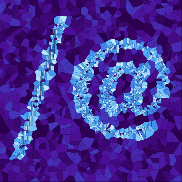
I have seen all these beautiful ideas dedicated to the logo and decided to add another one. And though it maybe already too late I still would like to post it – just to share and add to the pool of creative approaches. My train of thought was the following. Indeed Mathematica graphics is stunning and the logo should reflect on that. Yet the nature of the Mathematica functional language itself is very unique. Incidentally I also liked the simplicity of Apple SE idea - Apple command key is a unique keyboard symbol that indeed reminds many people instantly – “This is Apple stuff, yes, for sure…” But we have all these @,#,&,~, etc. that are famous entities of our programming meta-culture. Also Mathematica for me and many others is a creative discovery tool, something that allows ideas to emerge and solidify handsomely. So to summarize I was looking for something reflecting upon:

  • Unique simple logo reflecting on unique functional language
  • Creative discovery tool, idea emergence
  • Stunning graphics

I acknowledge it is probably not that “unique, creative, stunning”, yet here it is – some attempt:

enter image description here

This is the code to play with different designs. The code needs to be adjusted to scale well for smaller sizes. This can be done I think, please ask if you need help.

Manipulate[
 SeedRandom[rd];

 ListDensityPlot[(MapThread[
     Append, {RandomReal[{-.1, 1.1}, {800, 2}], 
      RandomReal[{0, .5 - s}, 800]}]~Join~
    MapThread[
     Append, {Rescale@pdata[[1 ;; -1 ;; 6]], 
      RandomReal[{.5 + s, 1}, Length[pdata[[1 ;; -1 ;; 6]]]]}]), 
  InterpolationOrder -> 0, Mesh -> All, Frame -> False, 
  ColorFunction -> gradients, ImageSize -> 600, PlotRange -> All, 
  PlotRangePadding -> 0]

 , "randomize"
 , {{rd, 7, ""}, 1, 1000, 1, ImageSize -> Small}
 , "thickness"
 , {{s, .1, ""}, -.5, .5, ImageSize -> Small}
 , {{gradients, "DeepSeaColors", 
   ""}, (# -> Show[ColorData[#, "Image"], ImageSize -> 100]) & /@ 
   ColorData["Gradients"]}
 , FrameMargins -> 0, ControlPlacement -> Left, 
 SynchronousUpdating -> False,
 Initialization :> (pdata = 
     Position[ImageData[Binarize@ImageRotate[ColorNegate[
          Rasterize[Style["/@", FontFamily -> "Times"], 
            ImageSize -> 200] // Image], -Pi/2]], 1];)]

Also it could be something as simple as beautified text. Here is our Identity function – just to symbols ;) Well that's just some raw ideas. I am sure it is too late anyway. The code that makes the text is at the end.

enter image description here

text1 = First[First[ImportString[
     ExportString[Style["#", FontSize -> 24, FontFamily -> "Times"], 
      "PDF"], "PDF", "TextMode" -> "Outlines"]]];

text2 = First[First[ImportString[
     ExportString[Style["&", FontSize -> 24, FontFamily -> "Times"], 
      "PDF"], "PDF", "TextMode" -> "Outlines"]]];

GraphicsRow[{Graphics[{EdgeForm[Opacity[.2]], 
    Table[{ColorData["TemperatureMap"][t], 
      Rotate[Translate[text1, 4 {-t, t}], -t/2]}, {t, 0, 1, 1/10}]}, 
   ImageSize -> Medium], 
  Graphics[{EdgeForm[Opacity[.2]], Table[{ColorData["TemperatureMap"][t], 
      Rotate[Translate[text2, 4 {-t, t}], t/2]}, {t, 0, 1, 1/10}]}, 
   ImageSize -> Medium]}, Spacings -> 0]
4
  • 3
    You get my +1, but it is going live tomorrow with this as its logo. It was deemed acceptable by the powers that be. This is not to say that it can't be changed if enough people don't like. Physics went through that with the entirety of their original design.
    – rcollyer
    Commented Jul 16, 2012 at 18:44
  • @rcollyer Thank you! I was traveling and a bit out of the loop. I just wanted to contribute something even if it was too late ;) Commented Jul 16, 2012 at 18:53
  • 3
    +1 this is by far my favourite. much, much better than either the one that it seems will be used or the previous one. shame. but I'll use it to produce wallpapers for my desktop if you don't mind :)
    – acl
    Commented Jul 16, 2012 at 19:30
  • @acl Thanks! Please do use it in any way you wish. Wallpapers - cool idea, I may make one of those myself with the above design. Currently my wallpaper is Mathematica-made Peter De Jong: complexification.net/gallery/machines/peterdejong Commented Jul 16, 2012 at 19:39
9

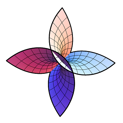
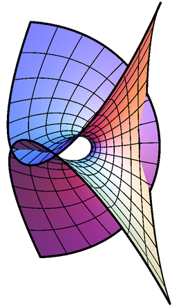
Far too late to the party but here are my 2c worth. I like the idea of using bracket or other typography unique to MMa. However, I was playing with the idea of using a mathematical construct like a Minimal Surface and rotate it so it 2D appearance results in some interesting geometry. Examples below.

Ennepers Flower

Or more symetrical. The meshing might not work well at all sizes and the colour scheme is just standard MMa but that might make it more recognizable. At least I always recognize a 3D graph with MMa if I see it in the standard colouring scheme.

Ennepers

Edit I should also provide the code for this:

Show[ParametricPlot3D[{u - (u^3/3) + u v^2, v - (v^3/3) + u^2 v, 
   u^2 - v^2}, {u, -2, 2}, {v, -2, 2}, Boxed -> False, Axes -> False, 
  MeshStyle -> Thickness[0.003], 
  BoundaryStyle -> Directive[Black, Thickness[0.008]], 
  PlotPoints -> 50], ImageSize -> 800]

And here another perspective. Quite versatile this object.

Ennepers MiniSurface 3

As pointed out in the comments below, thanks, this is one of Ennepers Minimal Surfaces. Details can be found here: Weisstein, Eric W. "Enneper's Minimal Surface." From MathWorld--A Wolfram Web Resource. http://mathworld.wolfram.com/EnnepersMinimalSurface.html

4
  • I really like the second one but i suspect any 3D object is going to be too hard to do in vector format for t-shirts etc.
    – Verbeia
    Commented Jul 17, 2012 at 3:22
  • @Verbeia Your right but with dedication one could vectorize it. There is a nice challenge to program in MMa ;-) Other option I am thinking about is rendering this in MMa at 4k pixel square and get that printed on a t-shirt.
    – Matariki
    Commented Jul 17, 2012 at 5:38
  • @Verbeia Does it really need to be vector? A very high resolution raster image should do (Rasterize[..., "Image", ImageResolution -> 600])
    – Szabolcs
    Commented Jul 17, 2012 at 12:37
  • For searching purposes: this is one of Enneper's minimal surfaces. Commented Jul 18, 2012 at 16:32
8

Attempt 1

Instead of the hexgrid in the initial design, I thought we could consider a tiling pattern that fits in with the spiky theme.

curve = Polygon[v_] :>    FilledCurve[
    Line[Map[{10 - #, #}/10 &, Range[0, 10]].#] & /@ 
     Partition[v, 2, 1, {1, 1}]];

bolics = v : {_?NumberQ, _} :> v Re[(ArcSin[2 Norm[v] - 1] + Pi/2)/2];

p = Polygon[Table[N[{Cos[t], Sin[t]}], {t, Pi/6, 2 Pi, 2 Pi/6}]];
pp = Polygon[Table[N[{Cos[t], Sin[t]}], {t, 0, 2 Pi, 2 Pi/6}]];

mini = Graphics[ Join[{AbsoluteThickness[2], 
     GrayLevel[0.91]}, (First@(p /. curve)) /. bolics], ImageSize -> 50];

minib = Graphics[ Join[{AbsoluteThickness[2], 
     GrayLevel[0.91]}, (First@(pp /. curve)) /. bolics], ImageSize -> 50];

row1 = PadLeft[{mini, minib}, 10, {mini, minib}];
row2 = PadLeft[{minib, mini}, 10, {minib, mini}];

tile = GraphicsGrid[PadLeft[{row1, row2}, 10, {row1, row2}], 
  ImageSize -> 300, Spacings -> {Scaled[-0.1], Scaled[-0.2]}, Background -> GrayLevel[0.95]]

enter image description here

I'm not 100% satisfied this - it looks weirdly irregular, even though it isn't.

Attempt 2

This demonstration can create nice tilings that can probably be cropped to be proper tiles.

I downloaded the code, changed the line defining colors to read:

{cK, cD, lK, lD} = {GrayLevel[0.95], GrayLevel[0.93], GrayLevel[0.97],
  GrayLevel[0.97]}

And then took a snapshot which I modified as below.

DynamicModule[{dec = 1, n = 6}, 
 Graphics[{EdgeForm[{Thin, 
     GrayLevel[
      0.8]}], (kite[0, #1, n, 
       dec] &) /@ {1, -\[Zeta], \[Zeta]^2, -\[Zeta]^3, -1 + \[Zeta] - \
\[Zeta]^2 + \[Zeta]^3}}, ImageSize -> {500, 400}]]

enter image description here

9
  • 1
    My vote is definitely for some variation on the Penrose tiling (the second one). Either the kite-dart version you're showing here, or the rhombus version. This has pentagonal elements (like the logo), it tiles the plane despite this ( :-) ) and it's aperiodic (cool and fits with the spirit of the site). If we go with the kite-dart version, it's possible to make it periodic at large spatial scales (which might be a requirement for Jin to scale to huge screens in the future).
    – Szabolcs
    Commented Jul 12, 2012 at 12:58
  • Actually I wanted to implement this, but then I had to leave. By the time I came back, you already has this post :) I think I'll implement the version which is periodic at long spatial scales while looks like a normal Penrose tiling at small ones.
    – Szabolcs
    Commented Jul 12, 2012 at 12:59
  • Well, I haven't actually implemented it, just changed the colours (sounds like a pattern for me...). I just looked at the tiling you linked to, and it would be really nice in the same pale greys that I have used.
    – Verbeia
    Commented Jul 12, 2012 at 13:03
  • I like the one I liked to (rhombuses) better than the kite-dark one (the one you show), but I am not sure how to make the rhombus one periodic without too much work ... I hope Jin accepts a very wide but non-tileable image.
    – Szabolcs
    Commented Jul 12, 2012 at 13:08
  • I like the second one better for the same reasons as @Szabolcs and because it has better contrast, i.e. I can see it without doing funny things to my monitor.
    – rcollyer
    Commented Jul 12, 2012 at 14:01
  • Haha, I just independently stumbled upon the last demonstration and was about to post it here when I see that you have too! I think the "arcs" setting might also be worth considering
    – rm -rf Mod
    Commented Jul 12, 2012 at 14:13
  • I love your Attempt #2. It's so much better than my standard hexagon tiles. But is this pattern possible to be cut to a square shaped, seamless tile for web use? If so, could you please send me the vector format?
    – Jin
    Commented Jul 12, 2012 at 14:34
  • @Jin: Ah, you need it to be tileable? That's slightly more involved... Commented Jul 12, 2012 at 14:59
  • 2
    @J.M. Yes. For print media, such as cards I don't need it to be tileable, just a version that covers a big area. However for web, it will be used as a repeated background image, so it needs to be tileable.
    – Jin
    Commented Jul 12, 2012 at 15:07
6

These are just preliminary thoughts after a long flight, which I'll update as time permits.

  • As well as avoiding the "spikey" look to avoid trademark issues, we should avoid replicating the canonical color schemes Wolfram uses. Nowadays that is black with red-oranges as seen in the website; red-orange is also the spikey's color. We could use purples, along the lines of the old Mathematica Book covers, or something completely different. Dark greens and coppery colors would go well with cormullion's proposed logo.

  • elements such as badge shapes could also be based on (2D representations of) variants on spikeys.

  • Cell bracket type styling on the right hand side of posts would be a nice touch.

2
  • 2
    For the colors, I think it would be best to leave that to the in-house designer. We can create the logos, badges, etc. in Mathematica, but ask him for color palette suggestions.
    – CHM
    Commented Apr 22, 2012 at 17:26
  • 2
    I miss the old purple scheme. Also, pre-V5 logos were multi-color. Commented Apr 23, 2012 at 14:29
6

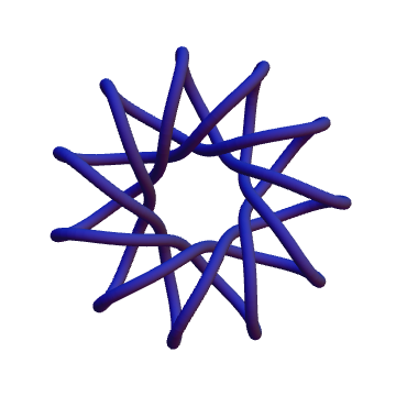
This would be a first attempt at a code that generates the knot. Graphics experts can prettify it

With[{absRoundabouts = 5, phaseRoundabouts = 2, depthRoundabouts = 5},
  ParametricPlot3D[
   Evaluate@
    Append[(2 + Cos[2 Pi t absRoundabouts]) Through@{Cos, Sin}[
        2 Pi phaseRoundabouts t], Sin[2 Pi t depthRoundabouts]], {t, 
    0, 1}, Boxed -> False, Axes -> False, 
   ViewVector -> {{0, 0, 15}, {0, 0, 0}}] /. 
  Line[pts_, rest___] :> Tube[0.8 pts, 0.2, rest]
 ]

Mathematica graphics

It's easy to play around to make it more spikey

With[{absRoundabouts = 7, phaseRoundabouts = 3, depthRoundabouts = 7},
  ParametricPlot3D[
   Evaluate@
    Append[(2 + Cos[2 Pi t absRoundabouts]) Through@{Cos, Sin}[
        2 Pi phaseRoundabouts t - 0.5 Sin[2 Pi absRoundabouts t]], 
     Sin[2 Pi t depthRoundabouts]], {t, 0, 1}, Boxed -> False, 
   Axes -> False, ViewVector -> {{0, 0, 15}, {0, 0, 0}}] /. 
  Line[pts_, rest___] :> Tube[0.8 pts, 0.2, rest]
 ]

Mathematica graphics

With[{absRoundabouts = 11, phaseRoundabouts = 3, 
  depthRoundabouts = 11}, 
 ParametricPlot3D[
   Evaluate@
    Append[(2 + Cos[2 Pi t absRoundabouts]) Through@{Cos, Sin}[
        2 Pi phaseRoundabouts t - 0.3 Sin[2 Pi  absRoundabouts t]], 
     Sin[2 Pi t depthRoundabouts]], {t, 0, 1}, Boxed -> False, 
   Axes -> False, ViewVector -> {{0, 0, 15}, {0, 0, 0}}] /. 
  Line[pts_, rest___] :> Tube[0.8 pts, 0.1, rest]
 ]

Mathematica graphics

6

Since Jin has already put up the (nearly) final design for the main site, here's the final code for producing our official logo, as adapted from the code by wxffles and the coloring by Verbeia (which is what I used when I sent Jin the *.eps logo file):

p = Polygon[Table[N[{Cos[t], Sin[t]}], {t, Pi/10, 2 Pi, 2 Pi/5}]];

triangulate = Polygon[v_] :> (Polygon[Append[#, Mean[v]]] & /@ Partition[v, 2, 1, {1, 1}]);

moretriangles = Polygon[{a_, b_, c_}] :>
      With[{ab = (a + b)/2, bc = (b + c)/2, ca = (c + a)/2},
           {Polygon[{a, ab, ca}], Polygon[{ab, b, bc}],
            Polygon[{c, ca, ab}], Polygon[{c, ab, bc}]}];

shrink = Polygon[{a_, b_, c_}] :> 
      With[{aa = (6 a + b + c)/8, bb = (a + 6 b + c)/8, cc = (a + b + 6 c)/8},
           {Polygon[{a, b, bb, aa}], Polygon[{b, c, cc, bb}],
            Polygon[{c, a, aa, cc}], Polygon[{aa, bb, cc}]}];

colour3[s_: LightGray] := q : Polygon[{_, _, _}] :> {s, q};

PolygonCentroid[pts_?MatrixQ] := With[{dif = Map[Det, Partition[pts, 2, 1, {1, 1}]]}, 
  ListConvolve[{{1, 1}}, Transpose[pts], {-1, -1}].dif/(3 Total[dif])]

colour4[s_: "SunsetColors"] := Polygon[v_] /; Length[v] == 4 :>
        {ColorData[s, 8/7 - 35/34 Norm[PolygonCentroid[v]]], Polygon[v]}

curve = Polygon[v_] :> 
  FilledCurve[Line[Map[{10 - #, #}/10 &, Range[0, 10]].#] & /@ 
    Partition[v, 2, 1, {1, 1}]];

bolics = v : {_?NumberQ, _} :> v Re[(ArcSin[2 Norm[v] - 1] + Pi/2)/2];

Graphics[p /. triangulate /. moretriangles /. shrink /. shrink /.
         colour3[] /. colour4[] /. curve /. bolics, ImageSize -> Full]

Export["mmaSELogo.eps", %]

enter image description here

5

I'm sitting in an airport waiting for a flight that might never come… so I play with Mathematica.

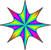
If we want to go with something that is both “spiky” and “colorful”, some 2D ideas could be fun. I have a naïve example to express what I mean:

enter image description here

Show[
 DensityPlot[
  Sin[6*ArcTan[x, y]]*(x^2 + y^2)^0.2, {x, -1.2, 1.2}, {y, -1.2, 
   1.2},
  ColorFunction -> Hue, PlotPoints -> 201,
  RegionFunction -> 
   Function[{x, y}, 
    Sqrt[x^2 + y^2] < 0.2 + Exp[-Abs[Sin[4*ArcTan[x, y]]]^0.7]]],
 PolarPlot[0.2 + Exp[-Abs[Sin[4*t]]^0.7], {t, 0, 2 \[Pi]}, 
  PlotStyle -> Directive[Gray, Thickness[0.015]]],
 PolarPlot[0.2 + Exp[-Abs[Sin[4*t]]^0.7], {t, 0, 2 \[Pi]}, 
  PlotStyle -> Directive[Black, Thick]],
 Frame -> False
 ]
2
  • It's neat - I like it. Some different colour schemes would be worth trying, too!
    – cormullion
    Commented Apr 22, 2012 at 12:08
  • 1
    Perhaps less colors and saturation? The Spikey is usually of one color hue which makes it more elegant (and helps to distinguish versions from distance). Commented Apr 22, 2012 at 14:56
5

I think good design elements (beyond just the logo) would be things that are recognizable features of Mathematica. For example:

  • cell brackets
  • In/Out labels
  • the default lighting for 3D surfaces
  • typesetting
  • idiomatic fonts and characters (\[ExponentialE], \[ImaginaryI], \[DifferentialD], etc...)
  • code in Courier
  • default styles for Plot (ColorData[1])
  • auto-italicise words, like Mathematica
5
  • I think the default lighting and plot styles is a little difficult considering it will vary depending on personal settings. However, the rest would be very useful.
    – rcollyer
    Commented Apr 4, 2012 at 16:12
  • 2
    @rcollyer: I mean that if you show me a picture generated by Plot[f[x,y], {x, x1, x2}, {y, y1, y2}], with no additional options set, I can instantly recognize that it came from Mathematica. Commented Apr 4, 2012 at 16:17
  • 1
    Oh no, not Courier...
    – rm -rf Mod
    Commented Apr 5, 2012 at 5:13
  • 3
    I strongly agree with the “not Courier” sentiment. Also, I think the reason default plot styling is so recognizable is that it is quite ugly, so I’m not sure it’s in our best interest to draw from it…
    – F'x
    Commented Apr 5, 2012 at 8:28
  • @F'x Maybe the default styling will change with the next version?
    – CHM
    Commented Apr 22, 2012 at 17:35
5

One think I like about tex.SE's design is the centered title (as opposed to the left-corner title on most SE sites, including Mathematica beta) with the tex-typical braces around them. I think we could do the same for Mathematica, using the double-struck brackets, i.e. "〚Mathematica〛" large centered at the top (like "{TeX}" for tex.SE).

In case it doesn't display correctly for you: 〚 is \[LeftDoubleBracket] and 〛 is \[RightDoubleBracket].

Another thought: We could use the authentic Mathematica fonts in the preformatted code sections where installed (as far as I understand it, SE sites don't provide fonts for display — which may be problematic with Mathematica font licensing — but rely on installed fonts; since HTML allows to specify fallback fonts, we could therefore display Mathematica fonts where installed, and standard fonts otherwise, without any licensing problems).

4
  • 2
    Oh please, no! Courier is ugly... (I don't mean to start a war... if the majority prefers Courier, so be it, but it certainly doesn't look clean or professional)
    – rm -rf Mod
    Commented Jun 3, 2012 at 0:14
  • No, Courier please.
    – rcollyer
    Commented Jun 3, 2012 at 1:40
  • 2
    @R.M @rcollyer Of course not Courier; we should modernize and use Courier Neue. ;-) Commented Jun 3, 2012 at 2:49
  • The default serif font (Utopia) is open-source, so there's no problem with that one. Commented Nov 16, 2012 at 21:49
4

Icon design

For fun I took the existing Stack Exchange site icons:

enter image description here

(Some of them you could never guess if you didn't know.)

There's a few that could be seen as Starry Symmetrical Thing, so perhaps something more asymmetrical would be good for Mathematica's icon. How about a big M?

Also, having a distinctive color makes recognition easier.

6
  • 4
    I disagree. We should have what suits us best and what we like — it's our identity and it shouldn't be dictated by how the logo looks in comparison to others. It's extremely rare for anyone to look at a giant matrix of SE sites and try to figure out which one mathematica is... If you had this page in mind, then the default sort for that is age of site and we can't do anything about that. I'm not all that opposed to having anything asymmetric/giant M as you suggested as long as that's what we like in absolute terms, not relative to other logos.
    – rm -rf Mod
    Commented Apr 23, 2012 at 15:23
  • Mathematica's Spikey is the logo of Mathematica, I don't think there's a way around using this on the site. The same thing would've been not using the Android as the Android logo. In addition, we've got plenty of Wolfram employees here, so getting permission to use the graphics should not be an issue.
    – David
    Commented Apr 23, 2012 at 18:43
  • 4
    @David It certainly will be an issue. The logo is trademarked by WRI and they will fight till their last penny to defend it. I don't think having employees here will change that. They could, if they wished, have a partnership with SE, just like Canonical did with the AskUbuntu site. Android's case is different, because I think there are far less restrictions on their logo. Notice how the logo for Ask Different is not the iconic half-bitten apple. At least Apple didn't object to the word in the URL, but LEGO most certainly did, and the site is now "bricks.se" and there's an ® in the logo
    – rm -rf Mod
    Commented Apr 23, 2012 at 22:20
  • 3
    @R.M, David: It still worth a try. At least one of the WRI employees could comment here about whether it is feasible or not, at all. Commented Apr 26, 2012 at 18:11
  • The SE logos have a coordinated style reminiscent of an infant's toys: unaggressive, hand-holdable objects with neither sharp edges nor aggressive colors. There is a very small palette of colors, a standardized lighting scheme, and no drop shadows. In this format, spikey would look very different from the official logo and almost certainly be frowned upon by WRI. Is there a way to convey something Mathematica-like within the design features adopted by SE?
    – DavidC
    Commented May 20, 2012 at 15:19
  • @R.M I think using a spikey thing that is clearly not the logo of any version of Mathematica, but it does make people think of Mathematica would be very nice. Like this one. This is very different from using the original Mathematica logo and it's also different from the sign on "Pnma" or "Puna" shoes (which try to look confusingly like "Puma" on purpose). We shouldn't drop the idea before at least getting some feedback from WRI ...
    – Szabolcs
    Commented May 21, 2012 at 10:48

You must log in to answer this question.

Not the answer you're looking for? Browse other questions tagged .